By Matt Fussell
Movement is one of the essential principles of art. Most, if not all of the eight principles of art deal greatly on composition. If you want stronger compositions, study the principles of art.
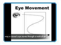
Movement in artistic compositions may refer to something called "eye movement". Eye movement is the way a viewer's eye moves through a work of art. By clever placement of objects in the picture plane of our artwork, we can control the eye movement of the viewer's of our artwork. This gives us, as artists, more control over how the viewer interacts with our compositions. Viewer's of our art will still take away from it what they will.
Studies have proven that geometric shapes tend to be more visually enticing. Therefore, incorporating geometric configurations to influence eye movement makes sense in creating good composition. These geometric configurations may result from the relationship between the positive and negative spaces found in the picture plane
Here are some examples of geometric configurations for composition...


Video Transcription
Welcome back to another video tutorial brought to you by TheVirtualInstructor.com. This is part two of a three part series on composition. Today we're going to be talking about eye movement through geometric configurations. And you're looking at the Mona Lisa here, done by Leonardo DaVinci, who was a mater at creating eye movement through geometric configurations. Now, what is eye movement? Well, eye movement is the way a viewers eye moves through a piece of artwork. This is illustrated here with a canvas and a line going through the canvas and out the bottom. You want to make sure, when you create a piece of artwork, that your viewer sees everything on the surface that you want them too. So, you can control the way a viewer's eye moves through a piece of artwork. Now, it's proven that geometric configurations are more aesthetically pleasing to viewers. So, it would make sense to create eye movement through geometric configurations. Here's one here, a triangular geometric configuration. This one, is in fact the one that Leonardo used in his Mona Lisa composition. Here's a quick sketch to illustrate that composition. Just a simple landscape with a mountain in the background, but you can clearly see that triangular geometric configuration at work here. If we put lines over the top, you can see how this was intended to control the viewers eye. Here's another example of that. Here we have setting diagonal line that goes through the middle of the piece. This is encouraging a viewers eye to move from the upper left hand corner to the bottom right hand corner. Here's a sketch to illustrate that point. And then when we take red lines and put them over the top, you can see how the viewer's eye movement is influenced by this composition. There are countless ways that you can use geometric configurations to control viewer's eye movement through your artwork. It's all about creating good compositions through eye movement. This has been another video tutorial brought to you by TheVirtualInstructor.com.
Here are some more art lessons that you may like...